Liquorstore Font at Boerentoren Antwerpen
OMG I can’t believe someone chose my Liquorstore font to spell out a poem all over a skyscraper in Antwerp! This picture is six years old but I just found out about it today. Isn’t that an incredible building? The words are a poem about how this modern building is in love with a cathedral nearby. Wow, so surreal and impressive.
And what’s up with that KBC changed to ABC up on top? So fantastical.
chank blog word cloud
well, here’s a pic of all the most popular words I’ve used at chank.wordpress.com for the last 4 years or so. looks like it all boils down to “USE COLOR TYPE FONTS, PEOPLE!”
it is so fun & easy to make a “word cloud” at http://wordle.net ! It is a fun and easy design tool that makes a word cloud out of the text you submit. or you can submit a website, like I did with my blog. so cool to see a few years of my words boiled down to one pretty typographic word picture!
A Ribbony New Script for the Target Holiday Catalog

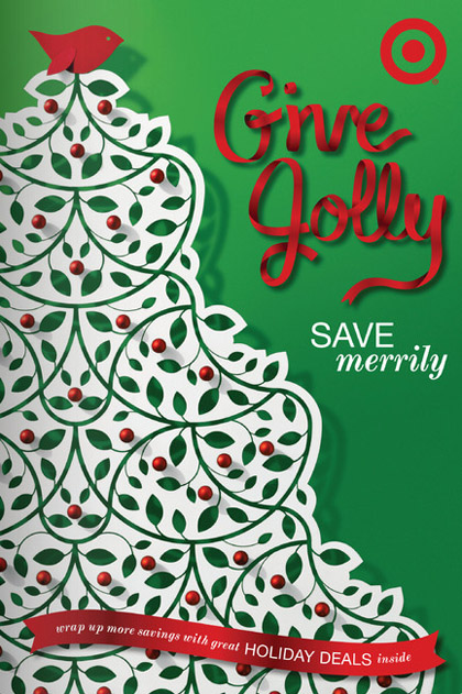
Well here’s an example of some color typography that I’m pretty proud of… check out that fancy ribbon type!
I was delighted to be able to help draw the ribbon script letters on the cover of this year’s Target holiday catalog, hooray! I worked with typographic illustrator Anne Ulku on this custom lettering job, with the helpful guidance of those smart art-director people at Target. So nice to be a part of the team, and I’m so happy with how this type turned out. You can view the catalog online at the Target website, or maybe you’ll see the final printed piece showing up in your mailbox some day soon:) Ho ho ho!
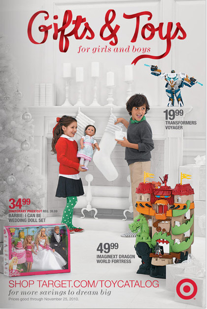
Drew a couple words inside the piece, too. Gifts & Toys! Here’s a pic of that one:

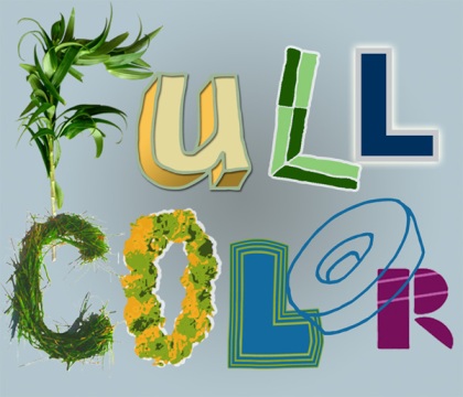
Full Color Type? Yikes!!!
There’s simply no easy way to implement
color fonts today. It’s easy enough for designers to think of ’em, though. “Hey I wanna see a font made out of different colors of jellybeans!” Yes, it would be great, jellybeans are fun to look at. And yes, it’s pretty easy to imagine how a jelly-bean font might look on an iPad or a postcard. But there’s just no easy way to do it. Lots of clumsy workarounds for the diligent designer, but no simple way to do it.
In the old days of printed words, when people got most of their information from books, magazines and newspapers, there was a cost factor involved with getting your words in front of readers. Four colors of ink were more expensive than just one. So the vast majority of words people read were presented in just black ink on white paper for economic reasons. One color of ink on paper was the cheapest way to get your words out to the people.
Now you don’t even need paper to show your words to millions. There are so many more ways to read type. On tv, on your computer, on a phone or a tablet. And in all of these new media, there is no added cost involved with rendering type in your choice of color. In fact, it turns out with lighted electronic displays, white on black is easier to read than black on white. But you don’t need to use black or white, you can use any color you can think of. Designers have an infinite array of colors to set type in. Yikes!
There are at least three problems with full-color fonts:
- For designers, there’s no convenient method to use full-color fonts.
- For the font creators, there’s no industry-standard format for creating full-color fonts.
- They are hard on the eyes. Full-color type needs to be used sparingly. Even if there was a way to easily use them, it takes a keen eye and advanced typographic skills to use them in a tasteful manner.
There is a technology called
Photofont, developed by Fontlab, which allows you to type with photographic fonts using a plug-in for Photoshop, InDesign or Illustrator. I’ve tested it out and it seems to work pretty well in all three apps. But it is really optimized for web use, and it is somewhat clumsy to have to install a third-party plug-in to use photofonts. I’m glad they made this app, and I hope they continue developing it, but it’s really frustrating that it still doesn’t help with high-quality print images at all. If you want to make your letters even 900 pixels high, you can’t do it. Full-color fonts for billboards are out of the question.
Another way for websites to implement color in their type is to start with a good strong font and then apply your own text effects using new
CSS3 text-shadow property to add your own flavor of colorization. But fancy CSS3 properties aren’t gonna help with your print job much.
So I don’t know where I’m going with all this, but I thought I should get my thoughts out there to spur discussion and development on the subject. I really enjoy making full color fonts, even though few people ever use them. That’s all.
Do you have any full-color font success stories? Do you know of new developments in the world of color typography that I should be aware of? Send ’em on to me! You can tweet me @chankfonts on Twitter, or send me an e-mail. My contact is on the bottom of every page at chank.com 😉
Making New Murals in St. Paul
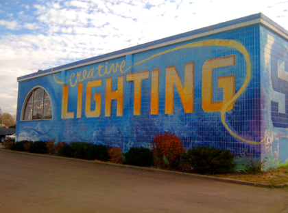
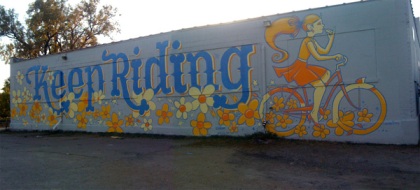
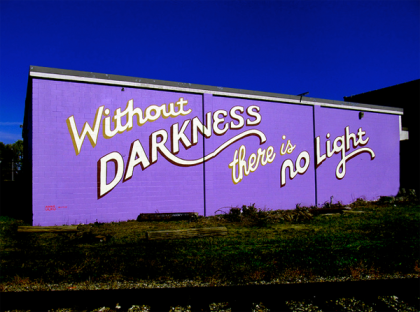
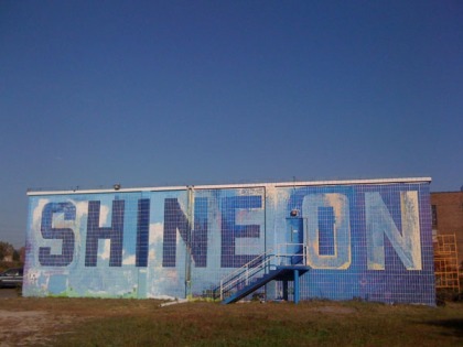
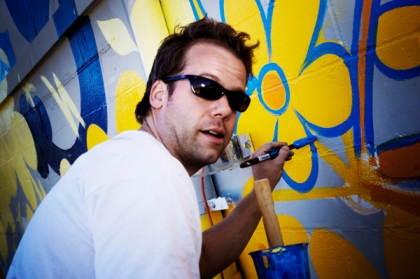
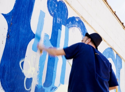
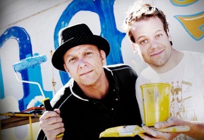
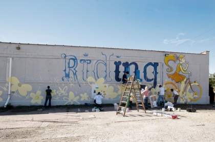
I’m working on FOUR new big murals for the Creative Lighting building in St. Paul, MN near 94 & Snelling. All four are still in progress, but here are some preview pics of the first mural. This one, measuring 15′ tall by 65′ wide, is a collaborative piece with Twin Cities’ poster artist and bicycle evangelist Adam Turman, one of my local art heros. He made the design and painted the lady. I made the Drunk Cowboy font and am still working on painting drop-shadows on that. We had lots of friends come out to help, too. Painting is fun. Thanks y’all!
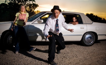
Painting continues on this mural and the other three next week. Extra special thanks to John Wallace who came out to take these “real photographer” pictures of the painting event. For press and media inquiries into this project, please contact JudyJudyJudy.

Adam Turman working on his first big mural.

Chank rolls out some big cowboy letters.

Chank Diesel & Adam Turman

All-volunteer crew hard at work.
Words you should really avoid using, seriously
I work with alphabets and punctuation marks, so it should be no surprise that I’m into grammar and writing, too. A recent tweet of mine that drew a lot of questions said “WRITING TIP: avoid using words that end in y.” Lots of people asked “y?”
This advice came from my college journalism professor, Ron Ross, who had a list of “UGH” words that you should avoid using whenever possible. I don’t remember all 7 words on that list, but I do remember the last one was my favorite: “any word that ends in y.”
That was aimed at journalism-style writing, but I think it applies to tweets, too. The reason is that lots of adverbs end in y, and adverbs are often passive, useless words that don’t enrich your writing. To write in an exciting, active voice, focus more on the nouns and verbs, cuz that’s where the action’s at. If you’re using adverbs, it might be because you didn’t choose the best verb. All I know is that when I take words that end in y out of my writing I like it better.
Some of the worst offenders are: really, very, fully, totally, truly, usually and especially. These words add bulk to your writing and don’t add much new information. Take ’em out and the meaning is often the same, just with a more direct voice.
Another one, which isn’t an adverb, is “my.” This one you should never use, because you shouldn’t write in the first person. Nobody cares about you; they only care about themselves. But there again, that’s journalism, not social media rules.
Another one is “try.” Yoda will tell you, there is no try, there is only “do.”
And “sorry.” That’s another one. I don’t need to know you’re sorry. Just try harder next time;)
Seriously. No more -y words, ok?
Really.
Thanks.
